User:Multichill/Visualize statistics on a map

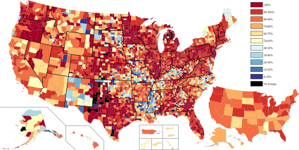
It would be very nice to have an easy, standard and automated way to Visualize statistics on a map.
We currently gather a lot of data for different project and we usually share these as tables (example). It would be much nicer to also have these statistics as a colored in map. For this we need:
- Base maps
- Statistics
- Color schemes to choose from
- A bot to produce the maps
Base maps[edit]

Base maps are SVG maps that are used as input of the process. The maps should contain CSS classes for the geographical entities which are in the statistics. These maps should be available for different levels, for example:
- World with continents map
- World with countries map
- Continent with countries maps
- Country with states/provinces/municipalities
At the moment most of these maps don't exist or are very hard to find on Commons. We should probably have one or more galleries to keep track of these base maps. We should have maps for every country with it's ISO 3166-2 divisions.
Statistics[edit]
The statistics should be key value pairs of the location and the percentage for the location. The keys should correspond with the CSS classes or some logic needs to be available to do the mapping. A standard system for this is ISO 3166-2. An example of a good source of statistics is the Monuments database.
Color schemes[edit]
You need to have a color scheme how to represent the different percentages. Beware of accessibility.
Bot[edit]

A bot should grab the base map, statistics and the color scheme and combine it into a new SVG image. This image should be uploaded to Commons on a regular basis. It would be nice to have this as a Pywikipedia module so it's easy to have multiple people run these kind of bots.